Setting a direction for the John Lewis app homepage
John Lewis Partnership is one of the UK's largest retailers. I joined the app homepage team as a Product Designer on contract, working alongside a PM, producer, lead engineer, Android and iOS engineers, and a UI designer, with stakeholders across design, digital, and trading.
The situation
The homepage team were busy but directionless. The trade and ad teams dictated what went on the page and where. The team had little control over component order and spent most of their spare time implementing the design system. There was no shared view of what the homepage was supposed to do, or how to know if it was doing it.
I was brought in to integrate UX into the team and set a direction for the homepage. In practice, that meant giving them something to design and experiment against: a vision grounded enough to make decisions from, flexible enough to test.
Understand
Before proposing any direction, I needed to understand what we were actually working with.
I pulled together existing user research, ran competitor analysis, and used Baymard's industry benchmarks to measure where we stood against e-commerce standards. I also reviewed how the design system was and wasn't being used, and mapped the business goals the homepage was expected to contribute to.
Mission vs. inspiration
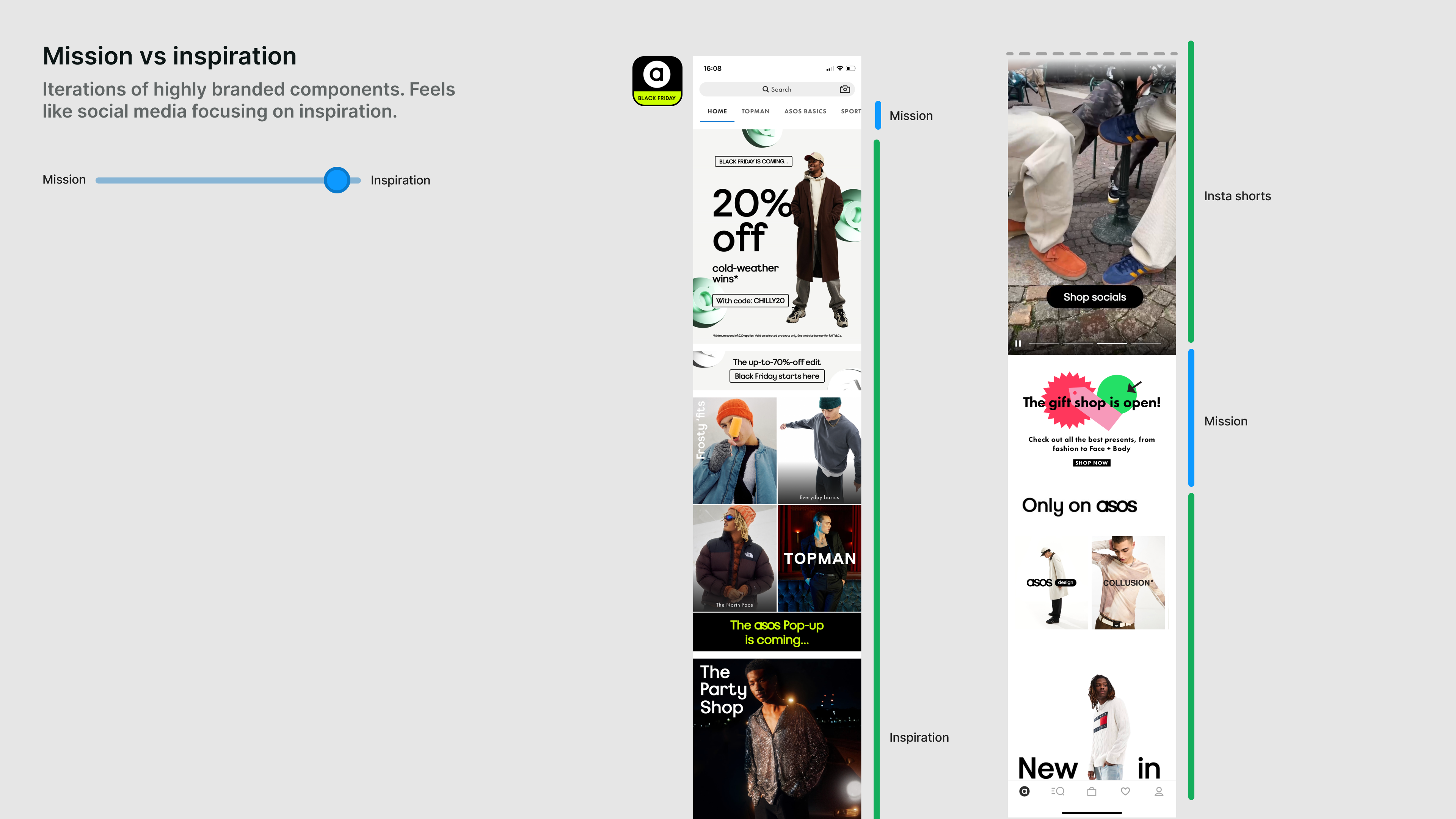
ASOS is inspiration leaning
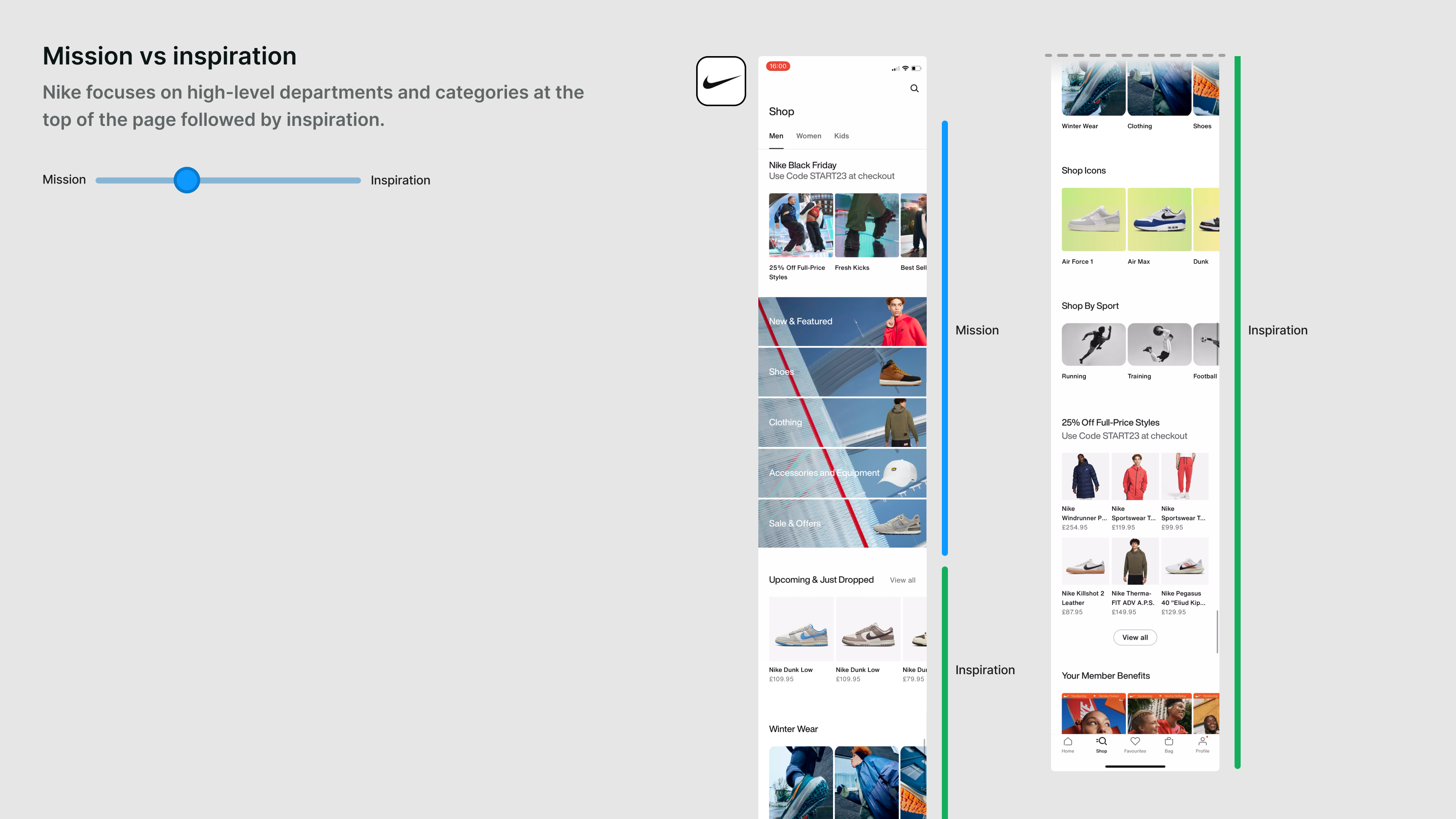
Nike leads with mission
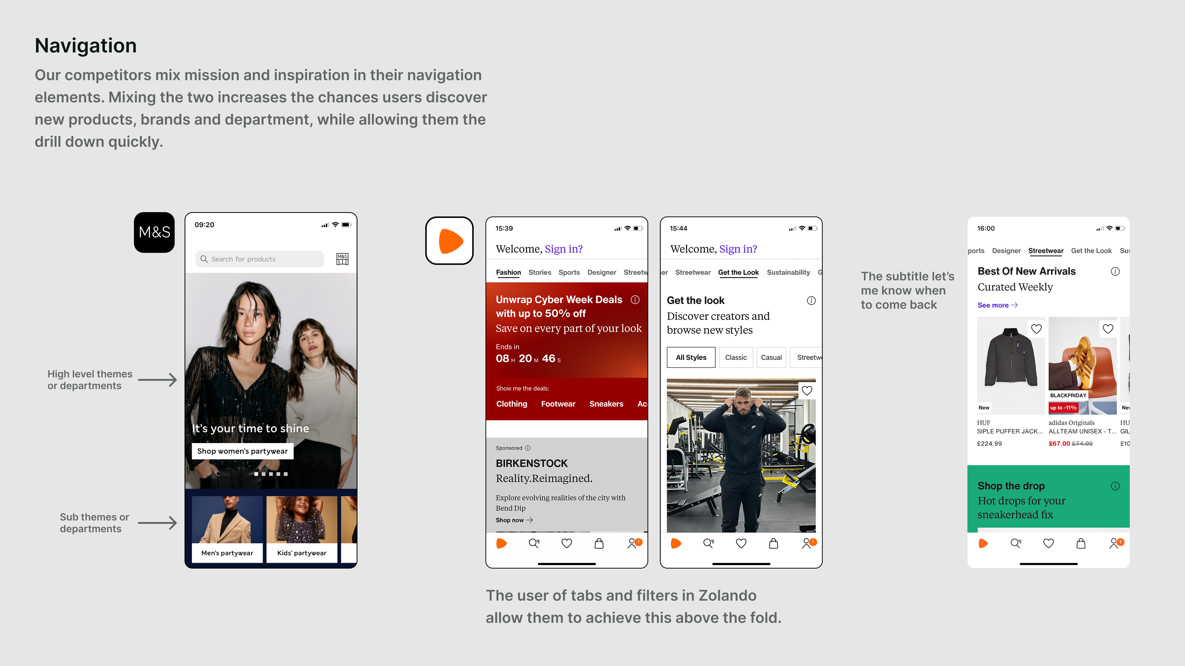
Mission and inspiration seen in navigation
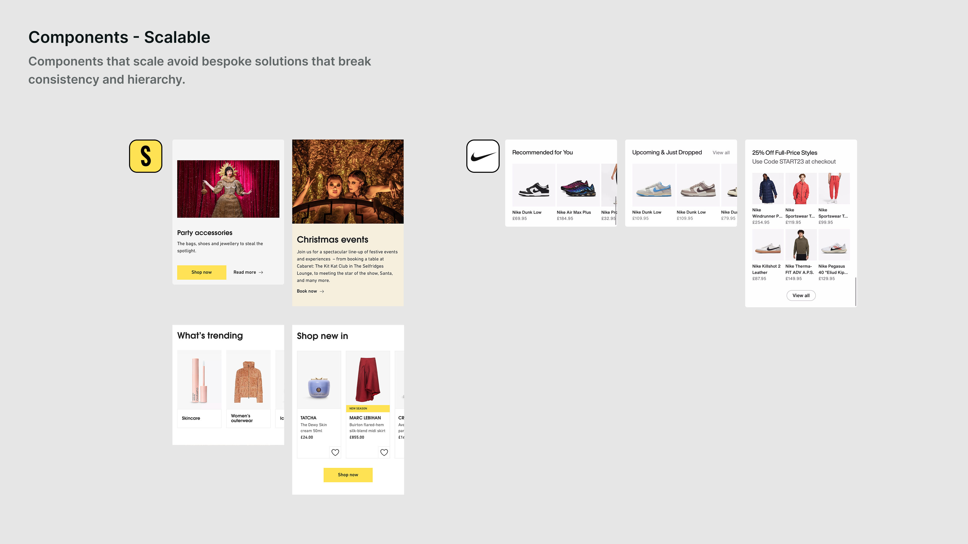
Examples of scalable components
User needs split into two distinct modes. Mission users know what they want and need to find it fast. Inspiration users are browsing, open to discovery, looking for something worth stopping for. The homepage wasn't deliberately serving either. Looking at competitors, we could see how different retailers had made that choice and what it meant for layout, hierarchy, and content.
Benchmarking against industry standards
Baymard industry benchmark audit results
The Baymard audit gave us an external, trusted benchmark. We were performing reasonably well overall, but a handful of specific issues were pulling the score down: category representation, hero carousel behaviour, content hierarchy. These became early wins the team could act on straight away.
The design system existed and was comprehensive. It just wasn't being followed. Stakeholders were requesting bespoke, one-off solutions that undermined consistency and made the page harder to scan.
The homepage KPI was "get-to-product": the number of users reaching a product page. But the team had very little direct control over that number. To move it, we needed users to find relevant products easily, in a layout clear enough that they'd keep going.
I presented findings to the team and to stakeholders separately. Both groups were encouraged that this level of thinking was happening.
Zoom out
Bringing findings together with the team.
Building a shared now / next / later for Q1.
With the research in one place, I ran alignment sessions with the team. We went through the findings together, added their knowledge and instincts, and worked out what we felt most strongly about solving. This fed directly into the team's OKRs and shaped a now / next / later that everyone had context on, because they'd been part of building it.
The central question that came out of it: mission-led or inspiration-led homepage? We had enough research to sketch what both could look like for JLP, and enough uncertainty that committing to one without testing would have been a guess.
Personalisation was a parallel sticking point. There was real disagreement internally about what it meant: a small tweak to one or two components, or something that should reshape the whole app? Should it be driven by what users tell us, or by what they do? We designed a structured user test to find out rather than argue it out in meetings.
The personalisation test
Departments concept: selecting favourite categories as chips
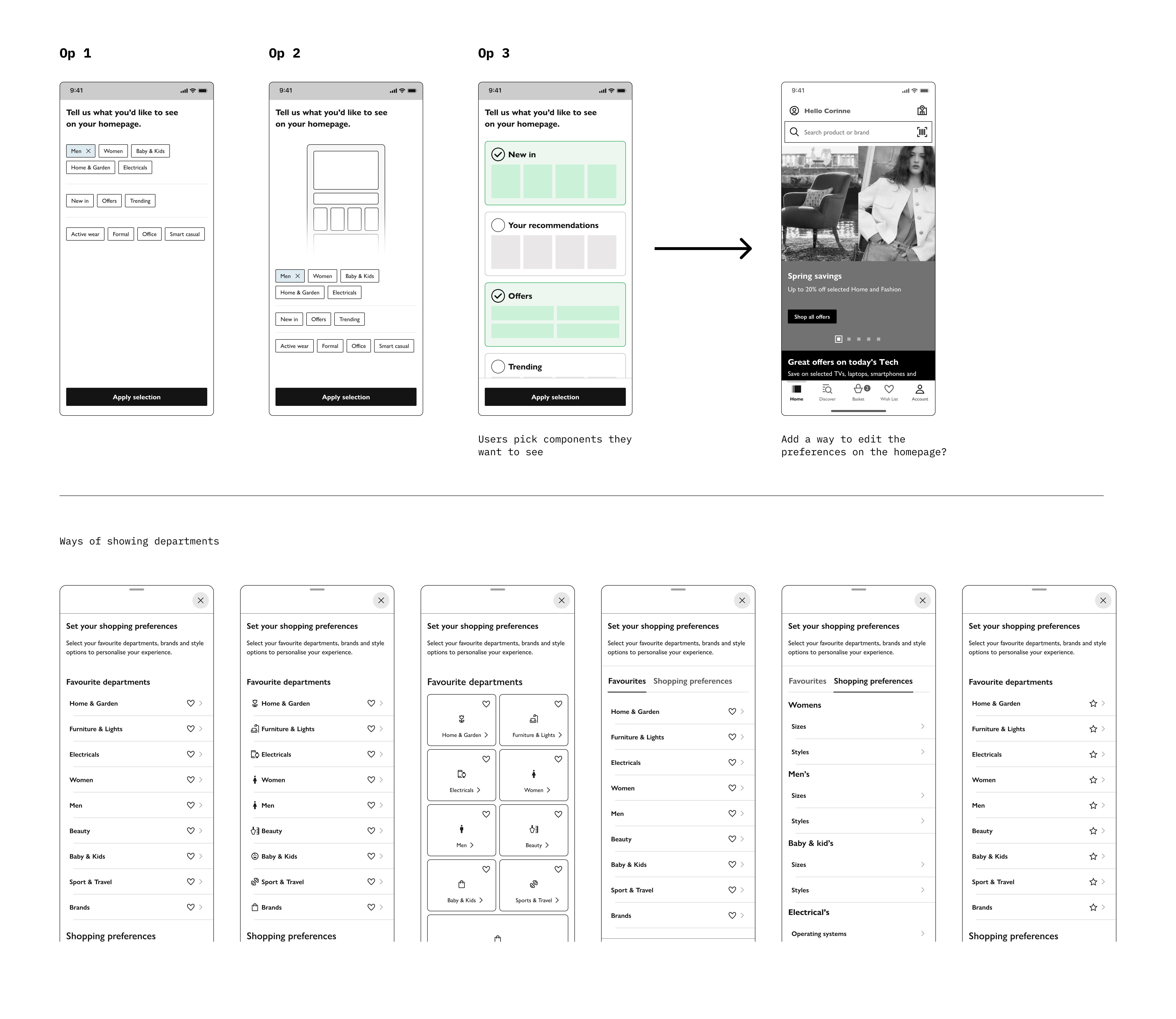
Deep preferences: departments, brands, sizes and styles per category
Three concepts tested
We tested three concepts across two days with ten participants.
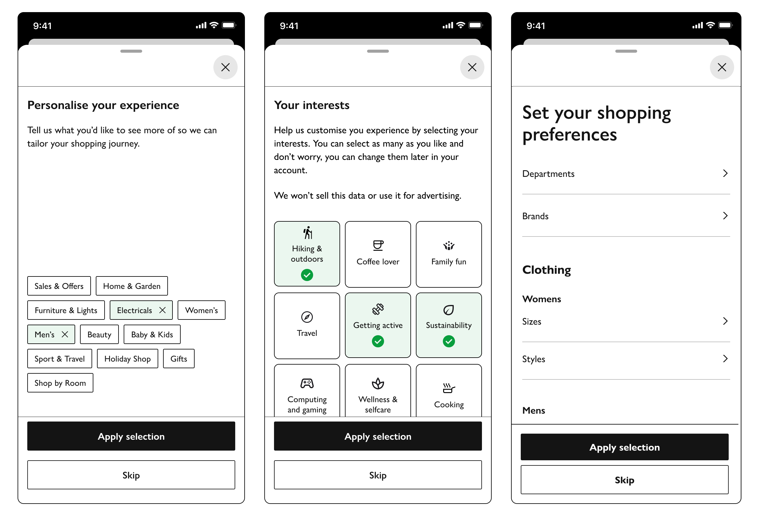
Interests presented lifestyle-based tiles with icons: Active Life, Cooking, Hygge, Fitness and so on. Users could select a couple and the app would tailor content accordingly. Visually clear and immediately appealing.
Departments let users select favourite top-level categories as chips. Familiar and functional.
Deep preferences went further: favourite departments, then brands, then sizes and styles per category. You could set preferences for the whole family if you wanted.
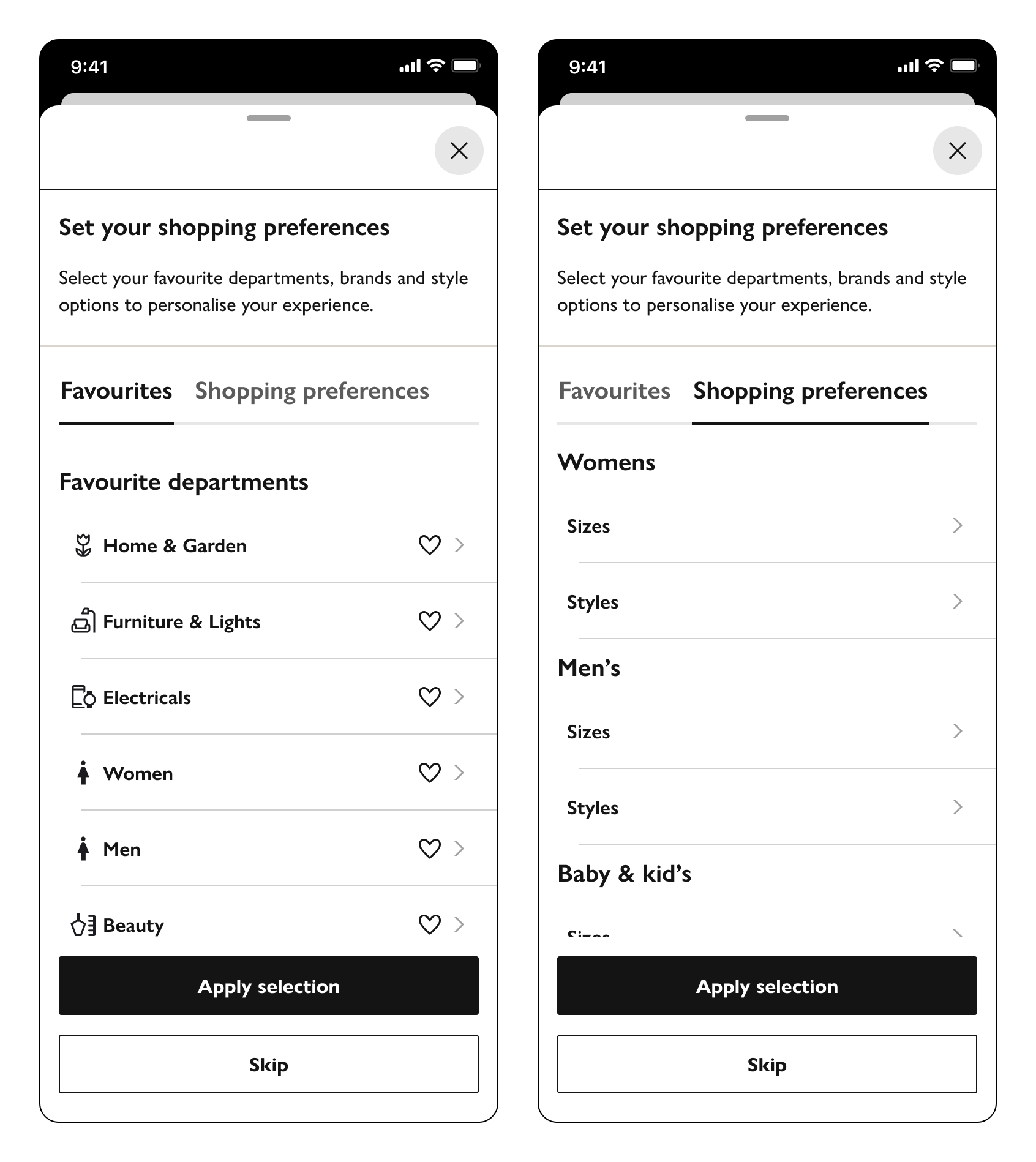
Interests concept: Departments with icons and shopping preferences tab for increased findablity
Users were drawn to the interests concept first. The icons and framing felt natural. But as they explored it, they expected the content to be organised by departments underneath, and were confused when it wasn't. The departmental concept made more logical sense but felt flat. Deep preferences showed clear value in principle but asked for too much upfront.
The direction that emerged: department-level organisation with the visual warmth of the interests approach, icons alongside categories to make it feel like a shopping experience rather than a settings screen. We also tested a homepage split, personalised content at the top and non-personalised below, which gave us a concrete model for how personalisation could work in the longer-term vision without requiring a full rebuild to get there.
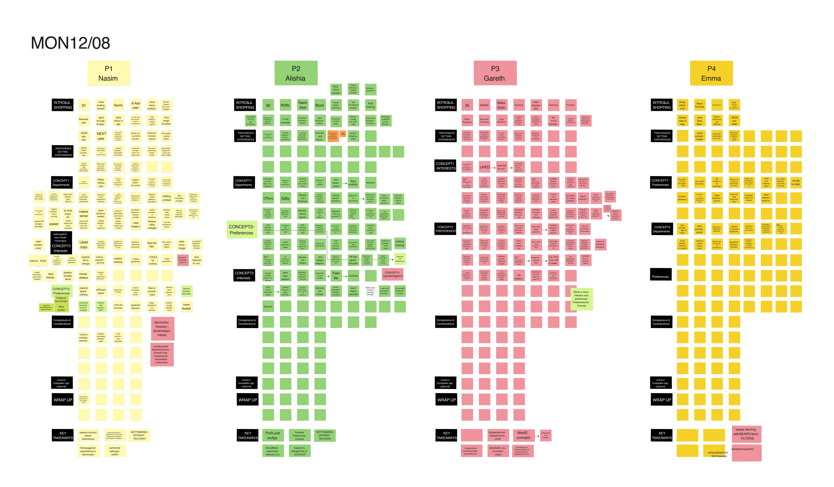
User testing synthesised in FigJam — ten participants, three concepts
One finding cut across all three concepts: trade content dominating the homepage undermines personalisation regardless of approach. Users didn't understand why commercial placements appeared where they did, and even when it was explained it pointed to a structural tension between what the business needed to show and what users expected to see. Design couldn't resolve that alone, but naming it gave the team a better frame for conversations with stakeholders.
Move forward
Three homepage directions. Each a meaningfully different answer to the mission vs. inspiration question
Rather than presenting a single recommended direction, I created three distinct homepage visions, each representing a meaningfully different answer to the mission vs. inspiration question. Lo-fi enough to be clearly explorations, different enough to generate real signal from testing.
The visions gave the team something to design against. Experiments could now be framed as: does this move us toward one of these directions, and what do we learn from it?
Example experiment process: hero carousel variants
In Q1, the team ran 9 experiments. Previously they'd managed around 3 per quarter. These included hero carousel variants, category navigation layouts, component positioning, search placement, and the first qualitative user test the team had run.
The homepage itself became cleaner and easier to scan as design system adherence improved.
The longer-term vision wasn't fully implemented. That's normal at this scale. What changed was that the team had a way to make decisions, and the confidence to run the experiments that would tell them which direction to go.
The result
The team went from around 3 experiments per quarter to 9 in Q1, with more already planned. The homepage became measurably easier to scan as design system adherence improved. The personalisation test resolved an internal debate that had been running for months and gave the team a clear direction to experiment against.